
In this draft I decided to go for a big bold masthead and a attractive image which will effectively draw my audience in with very few strap lines down the sides. I chose this idea as I think when effective it works wonders. If a image is powerful enough to draw readers in then the less strap lines will give less away to the aidience about the content. Hopefully the audience will want to buy it to find out.
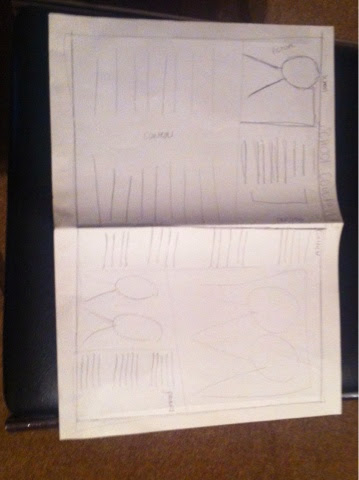
I specially liked the idea here of a smaller image and more focused upon strap lines to sell the magazine. Again with a nice big bold masthead the smaller images will take affect when the audience pick up the magazine or buy it but what will catch the eye is the strap lines of how words are being used and played with.

As shown in these pictures here using my research I sketched out a few rough ideas of how my front cover could potentially look and what I've liked from my research. There are 3 different idea that I put together to make what I have in the pictures.
No comments:
Post a Comment